From digital to print, we’re here for Boston
We work with departments across the City at the Digital Team. Sometimes, the work we do isn’t even digital.
In May 2017, the Office of Food Access and the Boston Public Health Commission approached us with a project idea. They wanted to create a map for people struggling to find and pay for food in the City. The map would show different locations around the City where someone who needs food help could get it. Another important feature? The map had to be foldable so that it could be easily carried and fit in someone's pocket.
The Greater Boston Food Bank, using Feeding America data, found that one in six Bostonians are food insecure. That means their diet lacks variety and quality. These residents may also have trouble finding food, and may be eating less food than is recommended for a normal diet. Those type of statistics keep many of us up at night, so we jumped at the chance to help the Office of Food Access.
Challenges
Figuring out the overall size of the map didn’t end up being an issue. But, designing the shape of Boston turned out to be more complicated than we initially thought. Unfortunately, our City isn’t laid out in a convenient way. It’s very long, and many of our neighborhoods are spread out.
Another thing we had to consider was Americans with Disabilities Act (ADA) compliance. We wanted to make sure that people with visual disabilities could still use our map. It’s easy to overlook, but decisions around colors and shapes can make or break your design. You might have something that looks great but isn’t useful to a portion of your audience.
Accessibility doesn’t just mean being ADA compliant. Not everyone in Boston speaks English as their first language. We also had to make sure our map could be created in multiple languages. We don’t have any language experts on the Digital Team, so we would need to reach out for help.
Solutions
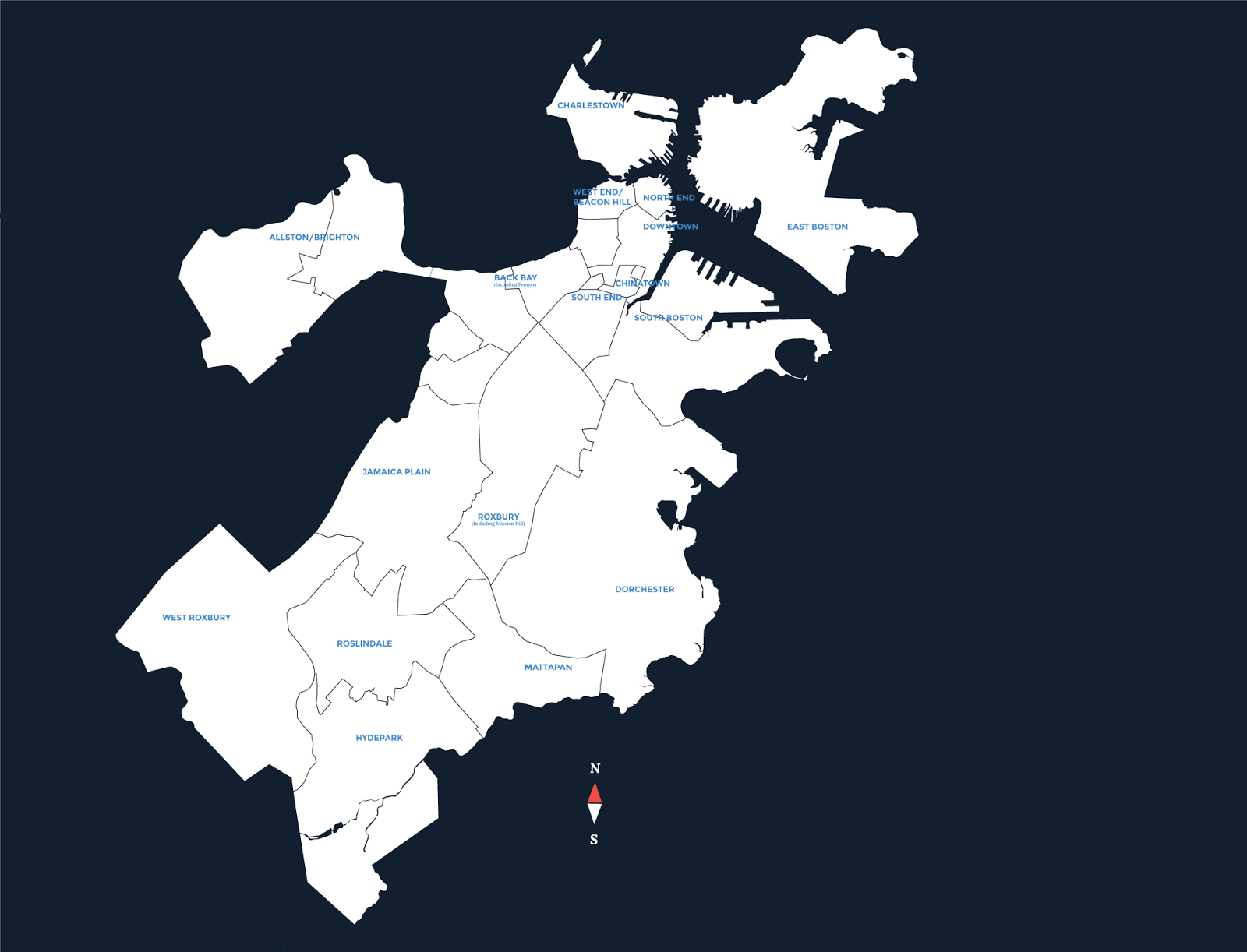
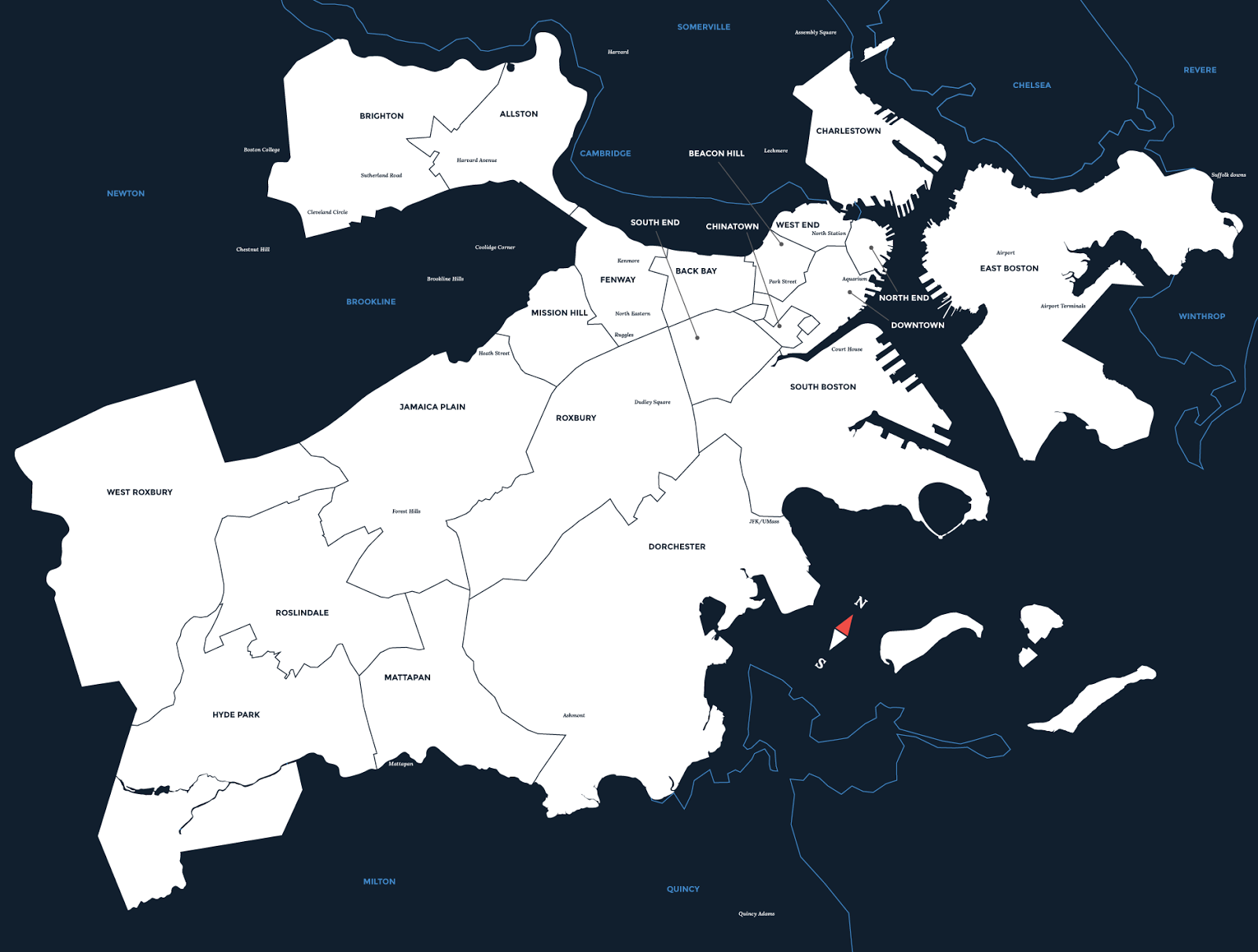
Since we were showing locations, we had to make the map big enough for our locations to be legible. We solved this problem by rotating the map from its normal axis. By using this technique, we were able to accurately depict the City’s layout at the size we wanted, all while keeping the locations readable.
Before rotating the map: After rotating the map:To solve the language problem, we needed help from our colleagues at the City. First, the Food Access team settled on five languages:
- Spanish
- Haitian Creole
- Vietnamese
- Russian, and
- Chinese (both simplified and traditional).
These were the most common languages spoken by residents struggling to find the food they need and want. The Boston Planning & Development Agency also helped in this process. They looked at common languages spoken in high areas of need in the City, as well as poverty rates.
We outsourced our translations to a third party company. But, translations can be tricky. The Food Access team found that we needed to clean up some of the text to make things clearer. Thankfully, staff members from the Offices of Immigrant Advancement and Food Access, as well as the Boston Public Health Commission, stepped up and saved the day. Instead of worrying about the words, we just had to worry about the overall look and feel of our list and map.
How did we handle our ADA compliance issues? First, we created categories for the locations on our map. Then, we assigned specific shapes and colors for each category. That way, even if someone has color blindness, they would still be able to distinguish the different locations based on those shapes. We also assigned a number to each location. These numbers can be used to reference our full list of locations on the back of our map.
In the end, we put together a useful, accessible map that’s also beautiful to look at. We hope you feel the same way. Our efforts are a great example of how we work with departments throughout the creation process.
There will eventually be a more “digital” version. We’ll keep the pdfs on the website, but this interactive map will feature some enhancements, including filters. Stay tuned!


