Brand Guidelines
The beauty of Boston begins with a certain boldness. A boldness of opinion. Of thought. Of diversity. A boldness to be ourselves. Even though we’re all diverse, and come from different cultures and backgrounds, we are connected through our boldness. And through our City. We are Boston.
This guide is just that. A guide. It’s meant to help you understand our strategy and decisions, and provide a foundation to build upon. We will add to it as we bring Boston.gov to life over the coming months and years.
BRAND STRATEGY
CONFIDENT
Make strong statements, not questions. People come looking for answers so having a strong point of view is crucial. Be direct and get to the point quickly. Don’t use the subjunctive. The words “if, maybe, but, may, could” don’t live in our vocabulary. The fewer adjectives, the shorter the sentences, and the less fluff the better. If you’re about to add a comma, think if a punchy full stop wouldn’t be better.
HELPFUL
We are here to serve — to make things easier and simpler for our citizens. Anything we say or any information we give, should be useful, easy to understand, and relevant to that individual.
OPTIMISTIC
Anything is possible in our world. If there’s a problem, we can fix it with a little ingenuity. All copy and content should reflect this optimistic tone. Where there’s a will, there’s a way. And if there’s ever a problem being communicated, it’s accompanied by a plan of action to fix it. We may be dreamers, but — more importantly — we’re doers.
HUMBLE
We may be confident, but we are never arrogant. Be conscious of what adjectives you may be using. Never be too verbose, or exaggerate. While your grammar should always be superb, your words should be simple. If your words have multiple syllables, rethink those words. Be careful how you describe your actions and plans. Keep in mind the people they’re meant to help.
PERSONAL
Visiting a website is a personal affair often done alone. Use personal pronouns like “we” and “you." Be honest. Be real. Be approachable. Be accessible and inclusive. Boston is made up of thousands of individuals, and you are there for every single one of them. However, never be too personal — slang or conversational language sounds strange coming from an institute of authority.
You can learn more about how to write in our brand voice here.
COLOR
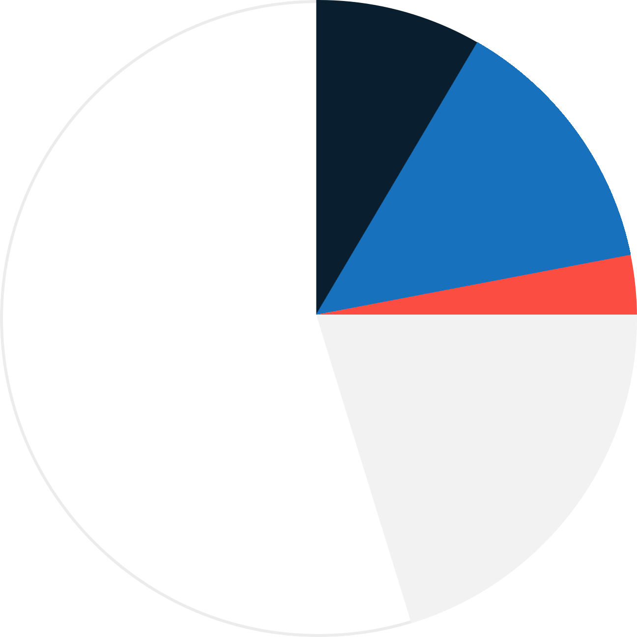
The mix of reds, whites, and blues of the color palette are contrasted with a modern gray. This reflects the progressive nature of the City, while paying homage to its iconic past. The primary color of the site is white. The use of white space is a grounding mechanism for clearly delivered content. The primary colors are the bursts that direct the eye to important notifications and moments of functionality. The supporting colors are there when your design needs some variation in order to work.
COLOR RELATIONSHIPS
The primary color of the site is white. If we zoomed out of the site you would see white spaces as the grounding mechanism for clearly delivered content.
The primary colors are the bursts that direct the eye to important notifications and moments of functionality. Use the blues strongly and purposefully, and use the red sparingly. Use the light gray liberally with white, while still keeping white dominant.
Primary Colors
CHARLES BLUE
hex: #091F2F
Pantone: 295C
RGB: 9, 31, 47
Use our dark blue for typographic headers, and as way to add contrast and weight to lighter pages. Use this color when you need something to look more official.
OPTIMISTIC BLUE
hex: #1871bd
Pantone: 285 C
RGB: 24, 113, 189
Use this blue for normal links and buttons, and as a background color. You should also use this color for the overlays on photography. Use this color when you need to inject warmth into a layout (and can be a little less official). Don’t use this color on top of Freedom Trail Red.
FREEDOM TRAIL RED
hex: #FB4D42
Pantone: 1788C
RGB: 251, 77, 66
A brick-red, inspired by the Freedom Trail. Use this color minimally. Red can be an alarming color and should be used carefully. Never use Optimistic Blue on top of Freedom Trail Red (and vise versa). They are too bright and vibrate when used on top of each other.
SUPPORTING COLORS
In certain design situations, you may find the primary colors limiting, so we have created supporting colors that carry the same tone and personality but give you more freedom. For instance, in our site layouts, we are using the range of blues and grays shown below when the primary colors are not working for the design. Only use the following if the primary colors are not working.
SUPPORTING BLUES
#061622, #0C2639, #45789C, #51ACFF
The darkest of these should be used very rarely – when you need something that resembles black. The next darkest-blue is used for our footer background color, so that it can bump up against our primary dark blue without issue. The desaturated blue can be used when you need text to visually recede. The brightest blue is used as a substitute for our primary bright blue when it needs to appear on a dark background.
SUPPORTING GRaYS
#58585B, #D2D2D2, #E0E0E0, #F2F2F2
The darkest gray is used for the body copy, and the lightest gray is used as a background color. The two medium grays can be used for a variety of things, like horizontal rules and miscellaneous borders.

City of Boston Logo
The new mark for Boston is not just the letter B but a bold letter B. Underlined. When something matters, we underline it. We use the B as a way to strike a friendly tone. While the seal is a symbol of authority, the B and the longer City of Boston logo is our way of showing we are human.

Digital seal
Boston's digital seal is used in place of the official seal on all digital properties and communications. The seal was created to work better at small sizes and on screens. There will also be times when a cleaner, more modern interpretation of the traditional seal is needed for print pieces.

City of Boston official seal
This seal should be used when the City needs to be the symbol of authority, such as on bills and non-digital forms. The City Seal was adopted in 1823. The first image of the seal was published in 1827. It became the official seal in 1914. We have more information on symbolism and Boston.
TYPOGRAPHY
MONTSERRAT
A B C D E F G H I J K L M N O P Q R S T U V X Y Z
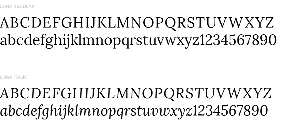
LORA
Lora is a well-balanced contemporary serif typeface with roots in calligraphy. It is polite, poetic, and warm as a typeface and is well suited for body text. Technically, Lora is optimized for screen appearance, but works equally well in print. Use it small for body text, or large and italic for quotes or other special secondary text. Pair with Montserrat whenever possible to reflect our bold, yet human voice. Download it
Arabic:
Markazi Text (Lora replacement)
Mada (Montserrat replacement)
Español (Spanish):
Lora and Montserrat
Kreyòl ayisyen (Haitian Creole):
Lora and Montserrat
繁體中文 (Traditional Chinese):
Noto Serif TC (Lora replacement)
Noto Sans TC (Montserrat replacement)
简体中文 (Simplified Chinese):
Noto Serif SC (Lora replacement)
Noto Sans SC (Montserrat replacement)
Français (French):
Lora and Montserrat
Tiếng Việt (Vietnamese):
Lora (or Palatino) and Montserrat
Русский (Russian):
Lora and Montserrat
Português (Brazilian Portuguese):
Lora and Montserrat
kriolu (Cape Verdean Creole):
Lora and Montserrat
Mac OS X
If you just need one font, double-click it and hit "Install Font." If there are multiple fonts, you can do the same thing for each. Another option is to open "Font Book" and select and drag all of the fonts to Font Book's center column.
To find Font Book on your Mac, open a Finder window, pick "Applications," and scroll down to Font Book.
Windows 7 / Windows 8
If you just need one font, double-click it and hit "Install." To choose more than one font, hit the "Start" button, then "Control Panel > Appearance and Personalization." From here, choose "Fonts." You can drag and drop the new fonts here.
Windows Vista
If you just need one font, right-click on the font file and then hit "Install." To choose more than one font, follow the directions above for Windows 7 / Windows 8.
Windows XP
You can drag and drop the font files you'd like to install into the "Fonts" folder on your computer. Hit the "Start" button and search for "C:\Windows\Fonts." One you have the folder open, drag and drop the fonts into it.
EMAIL TYPEFACES
If Google web fonts aren’t available and you need to replace your typefaces with system defaults, we recommend replacing Lora with Georgia and Montserrat with Arial. All of the same stylistic rules apply.
ICONOGRAPHY
ICONOGRAPHYEXPERIENTIAL ICONS
These bold line icons should be used for specific actions a citizen may want to take (like paying a parking ticket). Use them for transactions that need to jump off the page quickly so citizens can get in, and get it done. These icons are built using 3-pixel-width strokes and usually (but not always) have hard edges. Avoid too many unnecessary rounded corners.
DEPARTMENTAL ICONS
Departmental icons should be used for any content that has been created by specific departments. These icons indicate deeper content or may point you to the specific department pages. They are simply a wayfinding tool for people to see which department authored that specific content. With simple and solid shapes, they are meant to be recognized by a repeat user at a glance. They are filled with Charles Blue and underlined with Freedom Trail Red (see Color Palette).
SMALL CIRCULAR ICONS
For small in-line icons, we are using a similar style to the social media icons. They are surrounded by a 3 pixel circle and filled with our dark blue color. You will notice these being used on the homepage and on “Place” pages, but they could be used anywhere.
Photography
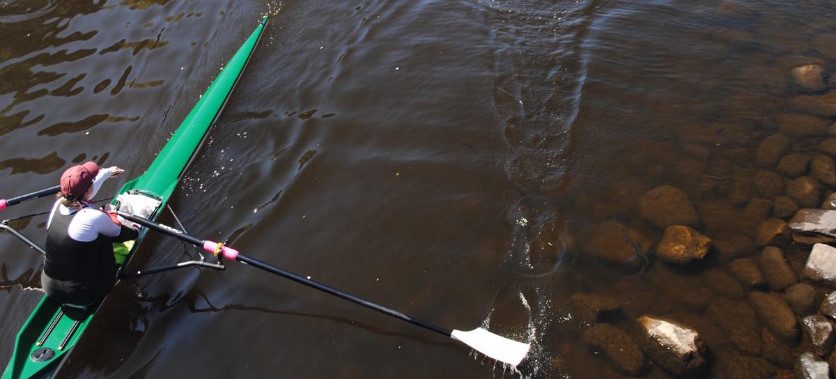
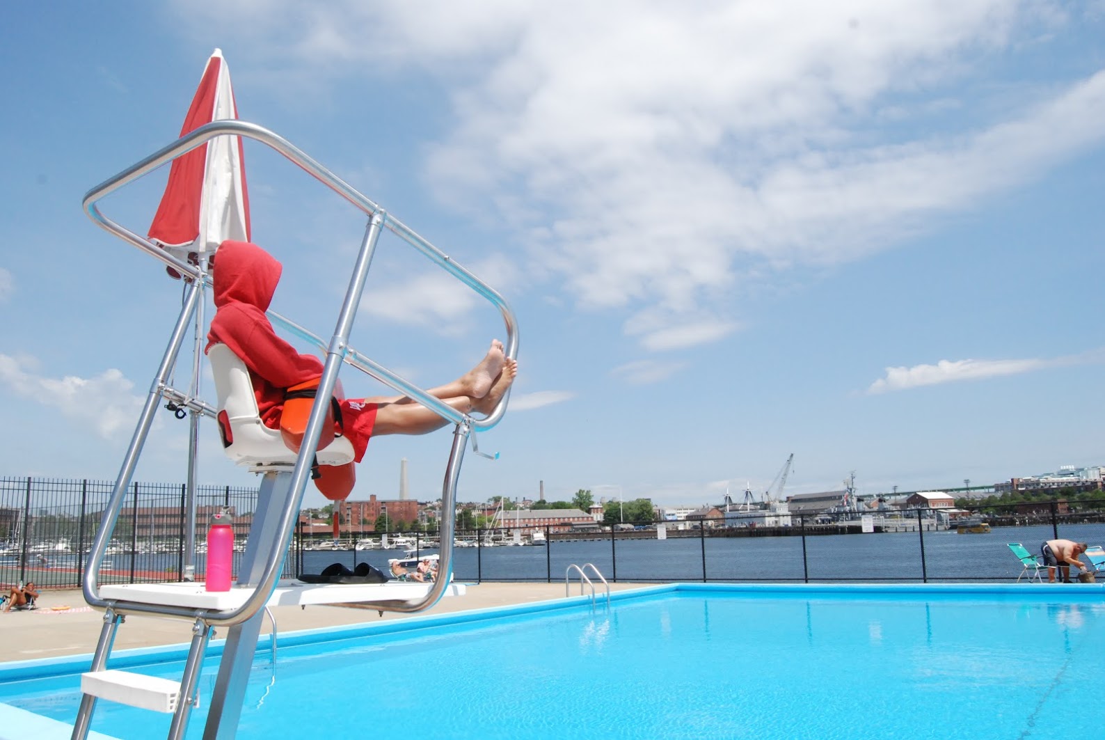
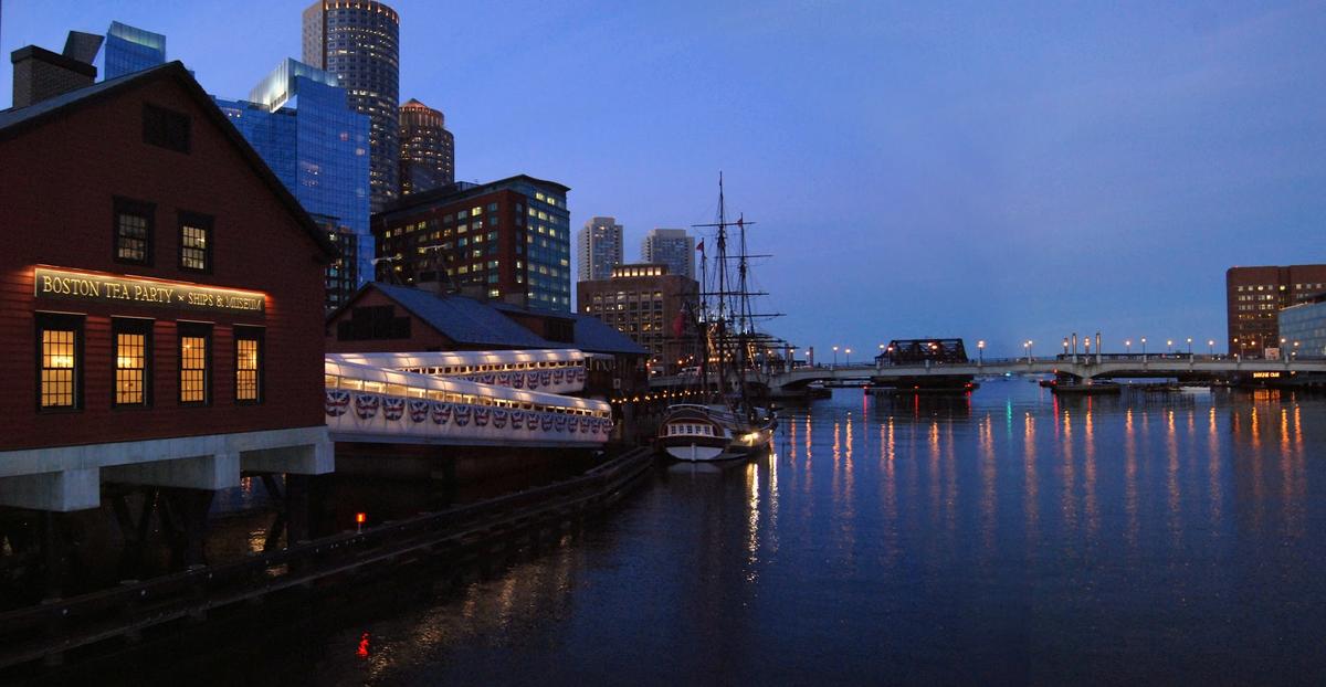
The site features three types of photos: people, skylines, and landmarks. We also have two different treatments: full color and blue overlay with type. This Google photos page is a great place to search for royalty-free photos that are free for city use. We’ve collected a few of our favorite shots, but there are lots of places to get free city photos. Only use photos the City of Boston has the rights for. If you need help please contact the Digital Team.
Digital team stock photos BPL flickr library of congress mayor's flickr page City Archives
PEOPLE CANDID PHOTOS
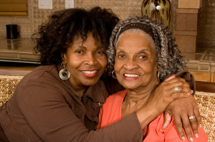
These should be images of citizens and City employees working, playing, and connecting with their community. These photos should take a candid and up-close look at the people of Boston as they go about their daily lives. Photos of people should — above all else — feel real and genuine, like something familiar that you see every day, but maybe don’t notice. Don’t use models. Don’t use stock. And don’t ask anyone to pose for a photo. There don’t even need to be people in the picture, just evidence of a strong human presence (like a half-eaten plate of delicious local food).
Do find real people doing real things in the less “famous” areas of Boston. Find candid moments, where people don’t know you’re taking their photo.
Do find moments where you can make a real Boston resident or employee feel a bit heroic in what they're doing. This is achieved here with the wide angle lens and a lower vantage point.
Do find interesting things in your composition to focus on – it might not always be people, and that’s ok. These type of photos are great because you can put text over the blurry part and still have it be legible. Imply human presence, even if there is no person in the picture.
Don’t be cliché – find a different spin on Boston. Don’t photograph people from above eye level. It tends to look like stock photography and feel less real.
HEADSHOTS
On the site, headshots of people should always be cropped to a circle. This helps distinguish and frame the more formal and official photos of elected officials from the candid photos. We know this will be difficult with so many City employees, but consider establishing a consistent headshot style that is easy to achieve when new people are hired. It should feel as though there is one team serving you.
SKYLINES
There’s nothing more optimistic than a city’s skyline. It’s filled with potential, hope, and stories yet to be discovered. Shots should showcase the diversity of our City through unusual perspectives. Help people fall in love all over again with Boston by shooting skylines from a-typical locations. Find the view that will be new to people — not the one they’ve seen a thousand times in brochures and tour books. If it looks like it could be in a tour book, throw it away! If it looks like stock photography, throw it away!
LANDMARKS
These are photos that show the City itself in an iconic light. History is woven into the fabric of Boston, making it nearly impossible to walk down the street without seeing a historical landmark at every turn. Similar to our notes on shooting the Boston skyline, find unexpected perspectives to shoot familiar landmarks. Shoot from the human perspective, which is not necessarily the dramatic perspective. That means taking pictures of the Citgo sign from the ground, not from a helicopter over the Charles River. Zoom in and crop to create a bold statement.
Employee toolkit
Please duplicate the document before beginning your work.
Please duplicate the document before beginning your work.
Please duplicate the document before beginning your work.
Please duplicate the document before beginning your work.
Copy and paste one of two options in this document with your information.
Please duplicate the document before beginning your work.
Phone and desktop backgrounds in our brand.
Please duplicate the document before beginning your work.
Please duplicate the document before beginning your work.
Please duplicate the document before beginning your work.
Layouts for media platforms
Layouts for media platformsPRODUCTION TIMELINE
If you’re interested in starting a project with the Creative Team, please take a look at the timeline below to give you an idea of what to expect. When work is translated it will add anywhere between 24hrs and a full week to the project length.
- Project contact: You reach out to the Creative Team and give them a high-level understanding of the project. We ask the same questions of each client.
- Kick-off, the Creative Team will ask the client to provide answers to the question we sent in step one. In this review, we will point out roadblocks and work with the client to find solutions. When all final copy and items are delivered to the Creative Team we move to step three.
- Creative work starts. When ready the Creative Team will submit the first draft for the client to review.
- The client provides a review and critique. This is the last opportunity for the client to change the text/script/story.
- Work is finalized and approved, Items are then sent out for translation. All translations MUST be double-checked. You can do that with Professional LCA Vendors or with the LCA Volunteer Pool. We will give our LCA volunteers about a week to verify that the translations are correct, but if after a week they are still not verified we will reach out to a second vendor to have them verified. If a second vendor is necessary, that will be taken from your department’s LCA budget.
- When Translations are finalized video/design is sent to the printer/PIO/press/content team for posting.


